
Saturday, 2 July 2016

Personal Project Evaluation
The personal project subject I have chosen to work with is Anxiety. I chose to work with Anxiety as my topic because, I have a lot of knowledge around this subject and It is something I care deeply about. I personally have had an experience with Anxiety and I figured it would be something I could talk about in depth and would like to raise awareness about. I know how severe this mental illness can be and how it can effect peoples everyday lives. I also thought it would be good to find out more information about Anxiety that I didn't already know, always good to learn something new as you go along. With my personal experience of having to deal with Anxiety for 2 years without knowing myself was something that I don't want others to also experience. As Anxiety is a mental health that cannot go unnoticed due to how serious it could affect a person. I also want the audience that I am aiming my topic about to be more aware about the symptoms and how easily unnoticed they can be. Choosing this topic, I think was a very easy topic for me to work with and a topic I enjoyed attempting to raise awareness with.
My idea's with choosing my topic were that I could create a poster helping to address Anxiety to an audience who are unaware of something that revolves around the subject. I think it is important to educate others on mental illnesses as they are a serious part of some peoples lives and easily slip without being recognised. I personally had not alot of idea about what Anxiety was or how It could make a person feel or what they experienced. Until I had experienced both the mental and physical symptoms myself but even then, I still didn't know it was Anxiety. I went off, of what people had told me about it rather than reading into any detail and finding out more. I think that displaying information on a poster including photography and a little digital design would be an easier way for me to illustrate my topic personally. My idea in general was for my poster to explain what flight or fight is. As when I surveyed my friends and family, the majority of them had no idea of what it was. So this made sense that I should attempt to raise awareness of this. I want to express what flight or fight is by using the shoulder angel and shoulder devil scenario. I think it will be a good idea to show flight and fight in this way because I could create 2 different characters just like the devil and angel but they would of course be resembling flight and fight. I also think it is good to illustrate it by using this idea as with the devil and angel, they are both known to say different things about a situation to put ideas into someones mind, to try and persuade the individual to choose the path of which either one of them is trying to get into their head. This can be related to flight and fight as it can easily be seen as the devil and angel resembling flight and fight, both 2 different thoughts battling it out in a persons mind in order to persuade which choice the person is wanting to go with. The photography in which this comes into will be, an image I have captured of a person deeply thinking and also a person with there head in their hands which was used for the slideshow as an extra for more detail. I also had the idea of showing how different a person with anxiety feels compared to others around them. I had the idea of using eggs to display the people, and then draw the same facial expressions on each and every one of them expect for one, which would display the odd one out. I thought this would have been a good idea to show that even though everybody may look and seem the same, that an individual with Anxiety can feel the complete odd one out. I displayed that idea by including it onto my slideshow slide which was about Anxiety being a serious mental disorder.
The test shot's I wanted to produce went well for the idea of the eggs that I wanted to use for my project as I did exactly what I planned to do with them. However I would have wanted to improve by if I had the chance again, I would have taken the shots with a professional camera so that I could change the ISO to make it brighter and be able to write more in depth of the steps I took with the camera in order to capture the test shots. I would have changed the image slightly in further editing with Photoshop by messing around with the brightness and contrast to try and lighten the image up. I also would have taken the images with a white backdrop so that It would have made it easier to crop around in Photoshop but I didn't so it made it hard for me to do anything with the egg images so thats when I decided to just include the egg idea onto the presentation as an extra bit of design.
The test shots for the poster work Id say went well except for the fact I left taking the test shots till last minute due to not having anyone to take picture of. Luckily my friend said she would help me out and I was able to take images of her to use for my poster and edit them very quickly for me to include onto my blog. I took into mind what I couldn't do with the egg images with taking the test shots with a professional camera so I improved by using one for these test shots so that I could mess around with the camera settings and change the ISO if needed. For this shot I used a high ISO 400 as there was alot of bright natural lighting. I also improved again with the test shots for the poster as I got my friend to pose in front of a clear background so it made it easier for me to edit later on. I took into mind again with using the professional camera for the third test shots I needed to capture to include onto my presentation. I took those test shots again with an high ISO. For the effect of the image I captured later on In editing I duplicated the image to overlay the other and moved it slightly to give the effect of a slight blur just to make it look better. I also lowered the brightness and messed with the contrast.
For the egg image the only thing I took into account was the idea itself and just focused on getting the right image. Photography terms wise I guess I did look into trying to take the image with the shallow field of depth effect. I chose to use this effect to try and make it look good, to not have the background in focus as I wanted the image to be focused on the eggs itself. Location wise I didn't think about that either and I just took the image without even thinking. However if I was to take the image again I would have set the location of having a clear white background so it would have made it easier to edit and make the image transparent in further Photoshop editing. I would have also tried abit harder to get the effect I originally wanted with the photograph as you cannot see the shallow depth of field. With the lighting I took in mind that in general the image would need to be quite bright to focus on the egg's and have an high quality picture as the outcome. I didn't use any extra lighting methods other than natural light that was already there. If I was to have taken this image again and considered lighting I would have maybe added a fill light behind the camera to help with the focusing. With the poster image I took into consideration with the effect was just to take it manually. I then considered for location it was to be taken with a clear background so it would make it easier to edit, and also have nothing else to focus on but the person in front of the camera. I took into consideration that as well as using natural light, I also used a a fill light. I used a soft box to try and brighten up the photograph and also to pick up more human facial feature details whilst taking the image. For the last test shots that I would be using for my presentation slide I took into consideration with the location, that I would be taking these test shots outside as for these test shots I did want a background involved. For the lighting I only used natural lighting as the day I went out to take the images it was bright outside and didn't need no added lighting. The I did lower the brightness later on in Photoshop as it was too bright.
As I do not have Photoshop I chose to do editing on pic monkey which is an online website used to edit and create photo's. I also used a downloaded software named Coral paint shop which is similar to Photoshop but just a free version, which I used to make the poster image transparent. The processes I took with the editing for the photography was different for each one. With the egg image I created, the only thing I did was altered the brightness a little higher to lighten it up. I also cropped some of the background off it as there was alot of unneeded background. With the photography that was used to create my poster I had to crop out the person and get rid of the background as it's not what I need. I then made the background transparent so I could easily add my image straight onto the poster, position it right and upload it to the blog as quick as I could. I also played with the brightness, lowered it a little and also played with the contrast just to see how the final image would turn out. With the presentation image I lowered the brightness down as it was very bright and thats not the effect I wanted for this image. I then duplicated the image as another overlay and moved it slightly to the side to make a blur effect just because I thought it would look good.
If I was to do this whole personal project work again. I would manage my time keeping better than I did this time as I rushed alot of work near to the end and I really pushed on my ability to get all assignments done before the deadline. I would have stepped up my game with doing the work when I was meant to be doing it as I got distracted and started slacking with getting all work completed. I would have managed my time keeping also, give myself set tasks to complete daily so that work would have been completed faster and not leave me stressing out last minute trying to get everything done. With the research tasks I would have improved them by adding more detail, adding links, adding facts, statistics, more extra details even if not needed. Also with the research I would have surveyed more people to get a better result in answers to use for my personal project. For the presentation I would improve next time by trying to make it stand out more, include more images, include little facts on each page and I would have included that on the ending and starting slide that my topic was Anxiety as I only stated that my presentation was about a personal project. With the photography I made a mistake with the test shots of the egg images by not using a professional camera, not knowing what camera setting I was using, not being in charge of ISO, Aperture or shutter speed. I made the mistake of not controlling the lighting or even thinking about the location of where I was taking the test shots. However I then learnt from my mistakes and then acted upon them for the next 2 test shots that I needed to take for my poster and presentation. I improved with then taking the next 2 test shots and made them better than the first time round. I took into consideration about the lighting and location and planned out how I was taking the next 2 images to get them perfect. I learnt from this whole experience with this project that time keeping is very important and should not be avoided. I have learnt that instead of stressing out about trying to get work finished before the deadline, that to just get it done with as quick as possible so that it will be of my chest and I will feel alot better. I also did learn more than I already knew about my topic which I guess was a bonus to this work assignment.
In my opinion I dont think that my image is up to what the brief wants. I can hope it is, as I tried my hardest to get everything done by the deadline and stayed up several nights making sure I got set tasks done. I tried my best and thats all I could have given to this project. I didn't have any software that would have made this work more efficient or better than it could have turned out but I dealt with that problem and worked around it and used all software I could use instead. I personally think that my poster turned out how I had planned to do it in my proposal, better than I had planned if anything. I stuck to my idea about the shoulder devil and angel and created my poster based around that idea. In conclusion with my proposal, I do think that my finalised work does match up with it. I think that I used the majority of ideas that I had planned to use, most of the information I had gathered, and I used my inspiration images and recreated them successfully. The proposal I did for the presentation I think went the best out of it all. I followed each step I had planned to do and accurately made the whole presentation the exact same as I planned. The only thing that didn't go to plan with what I had wrote about in my proposal was the egg images. I originally planned to make a whole individual slide based around that image but I changed my mind when in development of making the slideshow and just decided to add the image onto a slide as an extra. I didn't just want to not include it as I had already made this image and wrote about it so thats the way I decided to add it into this project work.
In conclusion, I do hope that my personal project work meets the assignment brief, as I do feel like I did all of the work set that I knew about needed doing, maybe with a few little bits I have missed out but could easily be improved if I had a little more time. I do think I followed my proposal very well and included the majority of what I had planned. Overall I am proud of what I have accomplished and I think although time keeping was my biggest issue, I have learnt now to deal with that more efficiently and I did my best to get all of the work that was needed doing by the deadline.
Wednesday, 29 June 2016
Poster Plans & Development + Finished personal project poster (still needs adjustments to last paragraph)
POSTER PLANS
I created a draft of what I imagined my poster was going to look like. Not in detail of what it was going to look like completely finished with facts added and meanings but just a rough idea. My poster is based on the flight or fight situation that people with anxiety experience on a daily basis. When I asked my friend's some questions about anxiety not alot of them knew what the flight or fight method was so I chose to create a poster that would make others aware of this situation. So my general idea was to have someone who is looking kind of down/sad or looking like they was thinking, showing this either with body language illustrating that or by facial expression, placed in the middle of the poster so then this poster would now have a character to use as an example to explain more about what needs to be explained.

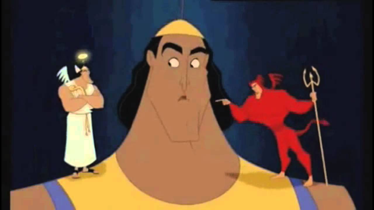
Then I wanted to use the shoulder angel idea were there is 2 characters either side of this person resembling flight and fight. I would edit some speech bubbles, some sort of text that would implicate that they are pouring thoughts into the persons head and what would happen if he chose that option to go with. I thought this would be a good idea as the angel and the devil are completely different characters and they pour different comments into the persons ear, trying to convince them to go with their plan or with whatever they're thinking which Is the same as fight and flight. As they are completely different and can both lead onto different endings in a scenario.
The text I then thought about was the title at the top of the page which would stick out of what the poster is going to be explaining. I was thinking of making the font stand out or be relatable with what ever theme I was going to use for the poster background. I then wanted a brief meaning of what fight and flight is underneath that title or close by. Then down below would be the images I previously spoke about. The last part of text I thought about would be if I was going to include little facts about anxiety or helplines around the poster and make them stand out by having a colourful object around it for example a bright pink star, a yellow heart, etc..
POSTER DEVELOPMENT:
I did not use Photoshop to create my poster but I did however use a website which allowed me to edit overlays, text, crop, filters, and a load of basic tools which I could use to create the poster I want to be created. The website I used was called Pic Monkey which I have had alot of experience with in the past and does also have some features that Photoshop does have, so I used both my knowledge of using the software pic monkey previously and what I have learnt on the college course about using Photoshop which came in handy. Here is a link to the website- https://www.picmonkey.com/
Below is a picture of what the editing programme looks like whilst using.

SIZE DEVELOPMENT:
The first thing I did was google image search a correct size A4 piece of paper that I could easily use as a starting image to create this poster.
Which looked like this:
I then decided to go with a theme of a graffiti style poster which I hope would stand out and grab the attention for the audience of teenagers as that is who I am wanting to be aiming at most as they are not as aware as others according to my little survey I did. I then chose a white brick wall backdrop layout which I thought would look nicely with what style I want the poster to turn out looking like.
I had to save the image from google and open as an overlay on my A4 picture. I then had to resize the image of the brick wall as it needed to be dragged out bigger to fit and fill the A4 paper up so it then looked like this.

OVERLAY DESIGN'S:
I then thought about how I would design this wall, It wasn't really important to do but I wanted to make my poster style stand out with bright colours and design. So I google image searched looking for some graffiti, tried to find ones that wasn't over the top, just little design's I thought was perfect. I then saw a paint can which looked good so I overlayed it onto my poster but I didn't quite like it. I then thought about making the title of the poster stand out with an effect and I thought about the paint can and I came to a decision of using paint splatters. I wanted to have a colourful one and I found the perfect design. I then overlayed this onto the top of the wall and that effect stands out nicely.
TEXT DEVELOPMENT:
I then added the text and searched for a font that would sort of look like graffiti and the font I chosen was the closest I could get to it. I thought it suited well and I started off by applying the blue font but it looked really plain and It wouldn't really catch my attention if I was to see it. I then duplicated the font so it was the same size, dragged it across a little and I then looked for a different colour to help it stand out and white and blue went together So I went for that choice.

PHOTOGRAPHY IMAGE USAGE:
So I first of all randomly google image searched 'transparent man thinking' and thought I could use it as a character for the poster. I then emailed Faye and asked about the usage of the image before I saved it. Once finding out about how I have to use my own photography I then just kept it there to see how everything would fit nicely onto the poster try and save some space for facts to place on the poster, the shoulder characters and the definition of fight and flight. I then decided to have a graffiti splatter behind the character as it looks good and would go with the style I am aiming to get my poster looking like. The colours I liked with the graffiti so I decided to pick this particular one.
TEXT ADDED ONTO POSTER:
For this I decided to stick to the same font I used for the type as I thought It would just look really dodgy and not good with a different style text. I went with the exact same technique with having one coloured text which was the bright colour of blue. Then I duplicated the text and added a white on top of it to make it stand out. I then did the exact same with text underneath and just changed the colour of the font. I repeated the technique again and added the same colour I started with as I liked the way that ended up looking like. On the photo of the evidence however you can't really see it as well as I can see it. It stands out alot better on the poster itself which will be uploaded somewhere down below.
Moving on I then wanted to sort of find a little image that resembles to the text and also goes with the whole graffiti theme that I want to show. I found this transparent fist that I could use and it was a bonus that the effect with the fist looked like it was peeling from something which might not be noticeable as it blends with the wall background. I chose to put it there as it just blended in the most in the current spot it is in.


ADDING THE MAIN IMAGE & CHARACTERS ONTO POSTER:
For the editing of this main image I used a software I have downloaded on my laptop which is similar to Photoshop but has its faults and is alot harder to work than Photoshop. I used coral Paint shop that I had once downloaded for free to edit a photo to get a transparent background. Luckily I could use this software to do the same with this main image. I used a tool which automatically cropped round the person I needed for the poster. I then deleted the background of the original image and was left with the person I photographed. I was then left with the transparent background, I altered the brightness and contrast a little and I then saved that to my computer. I then went onto pic monkey and added the image onto the poster. I position it exactly where I wanted it and then I was pretty much done with that. I then decided to use the characters from the Disney film inside out to resemble flight and fight. I used sadness and joy both to display the moods of each option that they are trying to persuade the individual to choose. Sadness resembles flight and also shows the path in which would end up being the worst one to choose, shows alot of negativity and I thought was a really good choice to use. Joy then resembles fight and shows the most positive outcome in which is the better option to choose. I got both of the characters from a google image search for transparent inside out characters. Saved them to my desktop. Then added them as separate overlays and positioned them exactly where I wanted them.


FINAL TEXT ADDED:
FINISHED POSTER:

I created a draft of what I imagined my poster was going to look like. Not in detail of what it was going to look like completely finished with facts added and meanings but just a rough idea. My poster is based on the flight or fight situation that people with anxiety experience on a daily basis. When I asked my friend's some questions about anxiety not alot of them knew what the flight or fight method was so I chose to create a poster that would make others aware of this situation. So my general idea was to have someone who is looking kind of down/sad or looking like they was thinking, showing this either with body language illustrating that or by facial expression, placed in the middle of the poster so then this poster would now have a character to use as an example to explain more about what needs to be explained.
Then I wanted to use the shoulder angel idea were there is 2 characters either side of this person resembling flight and fight. I would edit some speech bubbles, some sort of text that would implicate that they are pouring thoughts into the persons head and what would happen if he chose that option to go with. I thought this would be a good idea as the angel and the devil are completely different characters and they pour different comments into the persons ear, trying to convince them to go with their plan or with whatever they're thinking which Is the same as fight and flight. As they are completely different and can both lead onto different endings in a scenario.
The text I then thought about was the title at the top of the page which would stick out of what the poster is going to be explaining. I was thinking of making the font stand out or be relatable with what ever theme I was going to use for the poster background. I then wanted a brief meaning of what fight and flight is underneath that title or close by. Then down below would be the images I previously spoke about. The last part of text I thought about would be if I was going to include little facts about anxiety or helplines around the poster and make them stand out by having a colourful object around it for example a bright pink star, a yellow heart, etc..
POSTER DEVELOPMENT:
I did not use Photoshop to create my poster but I did however use a website which allowed me to edit overlays, text, crop, filters, and a load of basic tools which I could use to create the poster I want to be created. The website I used was called Pic Monkey which I have had alot of experience with in the past and does also have some features that Photoshop does have, so I used both my knowledge of using the software pic monkey previously and what I have learnt on the college course about using Photoshop which came in handy. Here is a link to the website- https://www.picmonkey.com/
Below is a picture of what the editing programme looks like whilst using.
SIZE DEVELOPMENT:
The first thing I did was google image search a correct size A4 piece of paper that I could easily use as a starting image to create this poster.
Which looked like this:
I then decided to go with a theme of a graffiti style poster which I hope would stand out and grab the attention for the audience of teenagers as that is who I am wanting to be aiming at most as they are not as aware as others according to my little survey I did. I then chose a white brick wall backdrop layout which I thought would look nicely with what style I want the poster to turn out looking like.
I had to save the image from google and open as an overlay on my A4 picture. I then had to resize the image of the brick wall as it needed to be dragged out bigger to fit and fill the A4 paper up so it then looked like this.

OVERLAY DESIGN'S:
I then thought about how I would design this wall, It wasn't really important to do but I wanted to make my poster style stand out with bright colours and design. So I google image searched looking for some graffiti, tried to find ones that wasn't over the top, just little design's I thought was perfect. I then saw a paint can which looked good so I overlayed it onto my poster but I didn't quite like it. I then thought about making the title of the poster stand out with an effect and I thought about the paint can and I came to a decision of using paint splatters. I wanted to have a colourful one and I found the perfect design. I then overlayed this onto the top of the wall and that effect stands out nicely.


TEXT DEVELOPMENT:
I then added the text and searched for a font that would sort of look like graffiti and the font I chosen was the closest I could get to it. I thought it suited well and I started off by applying the blue font but it looked really plain and It wouldn't really catch my attention if I was to see it. I then duplicated the font so it was the same size, dragged it across a little and I then looked for a different colour to help it stand out and white and blue went together So I went for that choice.

PHOTOGRAPHY IMAGE USAGE:
So I first of all randomly google image searched 'transparent man thinking' and thought I could use it as a character for the poster. I then emailed Faye and asked about the usage of the image before I saved it. Once finding out about how I have to use my own photography I then just kept it there to see how everything would fit nicely onto the poster try and save some space for facts to place on the poster, the shoulder characters and the definition of fight and flight. I then decided to have a graffiti splatter behind the character as it looks good and would go with the style I am aiming to get my poster looking like. The colours I liked with the graffiti so I decided to pick this particular one.


TEXT ADDED ONTO POSTER:
For this I decided to stick to the same font I used for the type as I thought It would just look really dodgy and not good with a different style text. I went with the exact same technique with having one coloured text which was the bright colour of blue. Then I duplicated the text and added a white on top of it to make it stand out. I then did the exact same with text underneath and just changed the colour of the font. I repeated the technique again and added the same colour I started with as I liked the way that ended up looking like. On the photo of the evidence however you can't really see it as well as I can see it. It stands out alot better on the poster itself which will be uploaded somewhere down below.
Moving on I then wanted to sort of find a little image that resembles to the text and also goes with the whole graffiti theme that I want to show. I found this transparent fist that I could use and it was a bonus that the effect with the fist looked like it was peeling from something which might not be noticeable as it blends with the wall background. I chose to put it there as it just blended in the most in the current spot it is in.


ADDING THE MAIN IMAGE & CHARACTERS ONTO POSTER:
For the editing of this main image I used a software I have downloaded on my laptop which is similar to Photoshop but has its faults and is alot harder to work than Photoshop. I used coral Paint shop that I had once downloaded for free to edit a photo to get a transparent background. Luckily I could use this software to do the same with this main image. I used a tool which automatically cropped round the person I needed for the poster. I then deleted the background of the original image and was left with the person I photographed. I was then left with the transparent background, I altered the brightness and contrast a little and I then saved that to my computer. I then went onto pic monkey and added the image onto the poster. I position it exactly where I wanted it and then I was pretty much done with that. I then decided to use the characters from the Disney film inside out to resemble flight and fight. I used sadness and joy both to display the moods of each option that they are trying to persuade the individual to choose. Sadness resembles flight and also shows the path in which would end up being the worst one to choose, shows alot of negativity and I thought was a really good choice to use. Joy then resembles fight and shows the most positive outcome in which is the better option to choose. I got both of the characters from a google image search for transparent inside out characters. Saved them to my desktop. Then added them as separate overlays and positioned them exactly where I wanted them.


FINAL TEXT ADDED:
FINISHED POSTER:

Friday, 24 June 2016
Slideshow Development + Planning (needs 1 slide PIC updating- self note)
So for my personal project I chose Anxiety to speak about as it is a touchy subject to me and just in general I feel like would be a good topic to talk about. I feel bad that I couldn't stand in front of a class and present this slide show like everyone else but I just couldn't physically imagine me doing it as I struggled with feeling confident and comfortable within that class with the pupils that attended the course which was down to myself feeling anxious so I think I went for the right topic to talk about.
I had already explained what each slide was going to be about in my pre planning blog post but I also did take note myself to help me along with each slide to make it easier. I took in mind what I was told to do with each slide. Not use an essay amount of writing for each slide, just a few sentences that were about the fragment of what each slide was based on. I chose 7 topics to do with anxiety or that relate with it and made a slide on each topic explaining what it is about including some facts, statistics etc..
Slide 1-
This slide is just my opening slide show which states my name on the bottom and then in the middle just to make it clear that the presentation is about my personal project. I chose a nice and simple background, simple text and just in general a simple design. What I would have done to improve next time is include what my slide show is actually about because just by looking at that beginning slide you have no idea what its about other than it is linked with the personal project.

Slide 2-
This slide is really an opening slide just explaining what anxiety is. I made it simple just because the subject of anxiety is quite a serious subject to talk about and I feel like if I made it really fancy it just wouldn't fit the subject at all. I added the definition of what Anxiety is and what it feels like. I also thrown onto the slideshow that people assume that anxiety is one individual mental health illness and just stated that it can be separated into different forms of anxiety and stated the following it could be classed under. Some of the definitions on the slide some may have heard of but others they might not know about If I had more time and was to do it again I would explain more of what the other forms of anxiety is and add the definition underneath. I would also have added a statistic of how many people on average suffer with anxiety.

Slide 3-
This slide I decided to add the symptoms of anxiety as I feel like this is such an important slide to get the message across about. I needed to add this slide as when I started to feel to symptoms of anxiety I had no idea what was happening to me and I thought I was ill and I had something wrong in general with my lungs because of the way anxiety affected my breathing and the chest pains I used to experience. I didn't have any idea that it could have been anxiety until I went to the doctors and they confirmed all of the symptoms to it and it then all started making sense to me and I just had to deal with that. I just think that people need to be aware of what the symptoms are mentally and physically and just to send that message that experiencing these symptoms is completely normal. If I was to do this slide again I would probably try and make it stand out a little more as it is really basic.

Slide 4-
This slide is based on fight or flight which I only recently learnt about whilst I was researching for this personal project and I guess its not really important but It is a part of dealing with anxiety. Also when I asked my friends and family of different ages, some anxiety questions for research not many of them knew what fight or flight was so I thought it should be a slide to explain for people to understand what it is. I also based my poster on this as with the survey results I got I thought it made sense to try raise awareness of the fight or flight scenario to everyone of different ages. I like the way this slide turned out as I included alot of facts about what it is, even included a scenario and a little diagram to help explain. This slide took the longest to make as It took me a while to develop my own photographs to include on it. If I was to do this slide again, I would try and make it stand out and make it stand out with different colours.

Slide 5-
This slide is questioning whether anxiety is a serious mental illness or not. This slide could potentially be a debating slide if someone was to disagree about it being serious or not. I stated my own opinion saying that yes It is a serious mental health illness, as I have experienced it myself and that It does affect the way things go in everyday lives. Also how it could change a person in general just because of the disorder. I then included 2 other mental illnesses that anxiety could affect, and also lead onto later on if things get really bad. I included that because some people take certain mental health problems serious and others not so serious due to what they have heard about it, or what they know about it. For example depression is well known for being a really bad mental illness and that lives are taken due to it, and I tried to give the message that having anxiety could have a huge impact on a persons life that it could even lead onto more serious disorders,

Slide 6-
This slide is about how to get help with Anxiety as again I personally think it is really important to know there is help out there. I did not know myself there was actually help you could get with anxiety. I thought that it was something that you just had to deal with and try and self help yourself. I personally helped myself with getting better as I was quite self motivated and I pushed myself to do more and more things as time went on. I included on this slide a website which helps people out with anxiety, little techniques or self help methods. My main aim with this slide was just to get the message across there is help. If I was to do this again I would have added medicines that you can take to help with anxiety, as I didn't quite have enough space to include that.

Slide 7-
This slide was all about the artist I selected to talk about. I just added who the artist was who I had chosen, why I had chosen him to display and displayed his artwork. I also added a little image I had found on google of him. Not 100% sure thats him but from what I researched I assume so. I then chose my favourite 3 art work of his and just added them on to show. If I was to do this again I would have added some personal details about the artist and I would have also added what I think about the images and the messages behind the artwork that Raine was trying to display.

Slide 8-
This slide is a recap of everything I spoke about within all of the slides. Thought this would have been a good slide to add which just some important facts and just a little touch up of each slide. I used different colours for the different topic's to help make the basic slide stand out a little more. I added the definition again, a few symptoms, flight or fight definition and the numbers and names of the helplines. If i was to do this slide again I would make it stand out more as it is really basic and Im not happy with the layout at all but overall it just states what needs to be stated so its okay I guess.

Slide 9-
This is then my last slide to end the presentation off. I stuck to the same design, some simple text and then simply added my name on the bottom. If I was to do this again I would have added again, what the slide show was actually about.

Tuesday, 21 June 2016
All drafts, developments and experimentation Ideas (INCLUDES ALL TEST SHOTS & ISO PROOF)
So in my proposal I talked about using eggs to express that although everyone may be human, and may all look alike, not everyone is the same. I also wanted to show that in a crowd full of people it can make just one person feel so different and odd to everyone else. I pictured in my mind exactly how I wanted to show this on my presentation with a photograph of eggs with all the same facial expression except for 1. I drew a quick rough sketch to show how I would want it to look.

These are the photographs I taken for this image for the presentation.
As you can see it is exactly what I planned to include, there was nothing that went wrong with this photograph, I didn't have to try multiple times to correct it. Id say the only problem with the images is that some of the eggs were smaller than the rest so you cannot clearly see there facial expressions. Aside from that it isn't nothing major that I couldn't work with.


POSTER TEST SHOTS:


Wednesday, 6 April 2016
Secondary research and summary + Survery images proof.
I didn't want to make a survey on survey monkey and put it on the group Facebook page as its abit late to be creating this. So I thought to myself that there has to be an existing survey on line about my subject. I googled several surveys and attempted to find another source of finding out different information on Anxiety but I couldn't find one. I then improvised by googling very useful information that I think would be very useful.
I found some pie charts with loads of information that I defiantly think was worth including on here.On this pie chart it listed the different ranges of ages and what percent of them it affects. I fount out that the highest percentage anxiety affects is between the ages of 45-64 with a 34.2% but not much less after that the second highest with the age range of 18- 44 with 31.7%. Which didn't take me by surprise as much although I would have assumed a higher percentage in the teenage years.
I then thought some more useful information would be to find out what the most common symptom of anxiety. I fount out that the most common was the feeling of their mind and body refusing to co-operate no matter what, which when I read it I realised I could relate alot too. The least common symptom was then chest pain, increased heart rate, muscle tension and sweating alot all tying together to be just as bad as each other. So to my knowledge I guess that just by researching it is secondary research but not as much as the brief is expecting. I then went out of my way and decided to ask a couple of my friends and family some questions about Anxiety to find out some more research.
I asked them these following questions:
1. Do you understand what anxiety is and how serious it could effect an individual?
2. Do you know anybody personally suffering with Anxiety if so how do you help them when they are feeling anxious or what would you do to help them?
3. Are you aware of the flight and fight scenario?
4. If you was to want to learn more about anxiety would you find it easier to look at photography images, a poster, or art work?
5. What in your opinion do you think the most common situation is for a person to feel anxious?
I asked 6 people these questions, I know its not 10 but I still got some useful information with it. I also asked different aged people to get a better variety. From the ages of 12-41.
So for the first question I asked 60% said yes they do know what it is. So that would mean that 2 of them didn't know what it was so it would be a good thing to cover that to get it clear. 1 of them not knowing was my brother who is 12 so that would kind of come across that the people younger don't know as much as the older ages. The other wasn't completely sure of what it was but I guess that was a no.
For the second question I asked, the majority of those said that they would comfort/distract a person if they was suffering with anxiety so maybe I could include on my slide show other ways to help someone suffering. A slide to alert others that if they ever see anyone having a panic attack or feeling anxious what they could do to try and help, give them multiple strategies.
The third question was so important to ask and the feed back I got made it clear that there needs to be a slide explaining the fight and flight because out of everyone I asked only 1 people knew what it was, which was the oldest person I asked. So I am going to have to take in mind a way to explain to the younger generation what this is.
For the 4th question it was 50/50 between a poster and photograph's so for a way to explain on the slides I could do a combination of both so then they have images to look at whilst also reading the information.
For the final question I got back alot of social based situations that they thought is the main reason for being anxious and also one person suggestion a emotionally anxious situation which was situations that you haven't experienced before for example motherhood, starting college, starting a new job etc. So I guess when you have to become responsible in situations it could make you anxious. Which I never would have thought of until now its been mentioned.
So in conclusion I have had good feedback from asking others and have found it very useful. I will take all this information on board when creating my slide show and taking the photography images to help try and explain what I am explaining so that others will get a clear image of what I am talking about.
IMAGES OF PROOF THAT I DID A LITTLE SURVEY:
1-

2-

3-

4-

5-

6-

Monday, 1 February 2016


Monday, 18 January 2016
Proposal and schedule
What theme have I chosen?
I have chosen my theme to be Anxiety. I have chosen this subject because it's something that I have personally been through and I think I could find it easy to research and talk about. The only thing I'm struggling with thinking about for this is I don't know what I could take photograph's of. I know that there are different ways that others experience it and cope with it and would be interesting to find out about the other ways. I think it would be interesting to see others experiences with it. I have overcome my anxiety that I was experiencing in years 9-10 of secondary school and I think that this would be a personal subject to talk about.
What medium's will I be using?
I think I will be using photography to take images of things to display anxiety. I will be using creative crafts to make things to illustrate what Anxiety could look like and how I could show what Anxiety make someone feel like. I have an idea to photograph someone with there head on the table looking miserable and then photoshop word's around the person's head to show what they're thinking and what is on there mind. I have another idea to draw faces onto some egg's and leave one looking different to illustrate that the one different egg feel's like the odd one out and doesnt feel like the rest. I also have an idea with mask's but I dont know if im going to proceed with this idea.
How I want my work to look?
I want my work to be a mix up of posters to show what anxiety looks like. I was thinking about using two different character's but within one person. For example you would have the person who everybody see's on the outside of a person and then another character for what the person is actually feeling like what nobody see's. I want to show that even thought that a person could display that they're happy. They could be inside feeling a different way that they never want others to see. I want to show what a person with anxiety could be thinking. I want to show in general a few picture images of different sides of a person. I want to come up with a way to show the fight or flight situation that people with anxiety go through and how hard it could be to flight or fight. I want to show that either flight or fight is as hard as each other. I want to show the barriers that someone would have to take in order to fight and flight. For showing that again I will create two different characters in mind like the devil and angel thing. I will have one persuading to flight or one persuading to fight and just show the thoughts that a person would think whilst choosing between the decision's.
Images I used for inspiration
I have found these images and I will explain why I am using them for inspiration.
 This one I am using as I find it powerful that it is showing the person's thoughts and I could combine this with the flight or fight idea. I could create two characters to go either side of my own photography like this and use the devil and angel idea but put my characters being on either side and I would name my characters fight and flight. I would show what they are both trying to persuade to get out of a situation that someone with anxiety doesn't feel comfortable with. For example if someone was to want to ask a teacher a question in class because they was stuck with the work. I could show the flight side telling her what would happen if she leaves the situation shes in so I could illustrate flight saying that if she doesn't ask then she wouldn't then understand the work and would fall behind and that the person is going to struggle with the work in silence. It's showing that flight could in general be a negative option to take. Then I could show fight saying things like 'if you ask you will understand the work and be able to carry on', 'you won't be falling behind on work'. This would be showing that fight in general could be more positive than flight. I will try and illustrate this by using this theme but different. Here is a picture if you didn't understand the structure I want to use for this below.

This image with the egg's is something I would be creating in my own time with creative craft's. I explained that I would want to show with this that someone with anxiety feels like they're odd and completely different to others with how there emotions are. I would be using no more than a carton of eggs and a felt tip pen just to draw faces on each egg and draw one different.

How I will present my work:
Presentation:
Slide 1- This will display my name and my topic.
Slide 2- What is Anxiety? Different forms, Fact's about Anxiety.
Slide 3- Symptoms of Anxiety. Including Egg image explaining about how they feel like they're the odd one out.
Slide 4- Flight or fight.
Slide 5- Is Anxiety a serious mental health problem?
Slide 6- Help line's, Helping with Anxiety
Slide 7- Artist
Slide 8- Recap
Slide 9- Ending slide.
Image Posters:
I will present my egg image with my symptoms slide of information. I will firstly explain how a person whilst feeling Anxious would immediately feel odd and different to the rest. I would be presenting this image along side with the symptoms of Anxiety and what someone may feel whilst feeling anxious.
I will present my next image with my flight and fight slide which will be the image with the idea of the shoulder angel and shoulder devil idea but only Id change it and create two different character's and they would each represent fight and flight. I would be inserting my own photography of a person holding their face in both hands and I would then have each character on either side of the persons shoulder. I am then going to insert a title which would be the situation that the person is in. I would then have flight discussing what would happen if this person decides to flight from it and then fight also saying what would happen if they fight the situation. This would look like to others that a person's mind fights with itself over the littlest things and how the mind tries to persuade itself.
For the last image I would have split it in half and duplicate the same image on each side but only the right will be different in a way to the left side. I will on the left side sub title this with ' What it may look like' and I would then have a simple classroom situation. I would have people sat looking at this person, people in groups looking at the person, the teacher, etc. I would then write thinking bubbles of what others are thinking whilst looking at this person, positive thoughts with thoughts that the person would not be thinking, for example 'wonder what this person's going to say.' whereas the right side will be sub titled 'what they actually see' and will have the people looking at this person thinking bad thought's for example 'oh look the shy one's finally going to speak' ' why her legs shaking the weirdo, its not even cold in here' 'her/his breath probably smell's, why they never talk.'
Artist Research:
https://uk.pinterest.com/rainephillips/mental-state/
Artist name : Raine Phillips
A few images of his artwork on Anxiety:


Schedule:

I have chosen my theme to be Anxiety. I have chosen this subject because it's something that I have personally been through and I think I could find it easy to research and talk about. The only thing I'm struggling with thinking about for this is I don't know what I could take photograph's of. I know that there are different ways that others experience it and cope with it and would be interesting to find out about the other ways. I think it would be interesting to see others experiences with it. I have overcome my anxiety that I was experiencing in years 9-10 of secondary school and I think that this would be a personal subject to talk about.
What medium's will I be using?
I think I will be using photography to take images of things to display anxiety. I will be using creative crafts to make things to illustrate what Anxiety could look like and how I could show what Anxiety make someone feel like. I have an idea to photograph someone with there head on the table looking miserable and then photoshop word's around the person's head to show what they're thinking and what is on there mind. I have another idea to draw faces onto some egg's and leave one looking different to illustrate that the one different egg feel's like the odd one out and doesnt feel like the rest. I also have an idea with mask's but I dont know if im going to proceed with this idea.
How I want my work to look?
I want my work to be a mix up of posters to show what anxiety looks like. I was thinking about using two different character's but within one person. For example you would have the person who everybody see's on the outside of a person and then another character for what the person is actually feeling like what nobody see's. I want to show that even thought that a person could display that they're happy. They could be inside feeling a different way that they never want others to see. I want to show what a person with anxiety could be thinking. I want to show in general a few picture images of different sides of a person. I want to come up with a way to show the fight or flight situation that people with anxiety go through and how hard it could be to flight or fight. I want to show that either flight or fight is as hard as each other. I want to show the barriers that someone would have to take in order to fight and flight. For showing that again I will create two different characters in mind like the devil and angel thing. I will have one persuading to flight or one persuading to fight and just show the thoughts that a person would think whilst choosing between the decision's.
Images I used for inspiration
I have found these images and I will explain why I am using them for inspiration.
This one I am using as I find it powerful that it is showing the person's thoughts and I could combine this with the flight or fight idea. I could create two characters to go either side of my own photography like this and use the devil and angel idea but put my characters being on either side and I would name my characters fight and flight. I would show what they are both trying to persuade to get out of a situation that someone with anxiety doesn't feel comfortable with. For example if someone was to want to ask a teacher a question in class because they was stuck with the work. I could show the flight side telling her what would happen if she leaves the situation shes in so I could illustrate flight saying that if she doesn't ask then she wouldn't then understand the work and would fall behind and that the person is going to struggle with the work in silence. It's showing that flight could in general be a negative option to take. Then I could show fight saying things like 'if you ask you will understand the work and be able to carry on', 'you won't be falling behind on work'. This would be showing that fight in general could be more positive than flight. I will try and illustrate this by using this theme but different. Here is a picture if you didn't understand the structure I want to use for this below.This image with the egg's is something I would be creating in my own time with creative craft's. I explained that I would want to show with this that someone with anxiety feels like they're odd and completely different to others with how there emotions are. I would be using no more than a carton of eggs and a felt tip pen just to draw faces on each egg and draw one different.
How I will present my work:
Presentation:
Slide 1- This will display my name and my topic.
Slide 2- What is Anxiety? Different forms, Fact's about Anxiety.
Slide 3- Symptoms of Anxiety. Including Egg image explaining about how they feel like they're the odd one out.
Slide 4- Flight or fight.
Slide 5- Is Anxiety a serious mental health problem?
Slide 6- Help line's, Helping with Anxiety
Slide 7- Artist
Slide 8- Recap
Slide 9- Ending slide.
Image Posters:
I will present my egg image with my symptoms slide of information. I will firstly explain how a person whilst feeling Anxious would immediately feel odd and different to the rest. I would be presenting this image along side with the symptoms of Anxiety and what someone may feel whilst feeling anxious.
I will present my next image with my flight and fight slide which will be the image with the idea of the shoulder angel and shoulder devil idea but only Id change it and create two different character's and they would each represent fight and flight. I would be inserting my own photography of a person holding their face in both hands and I would then have each character on either side of the persons shoulder. I am then going to insert a title which would be the situation that the person is in. I would then have flight discussing what would happen if this person decides to flight from it and then fight also saying what would happen if they fight the situation. This would look like to others that a person's mind fights with itself over the littlest things and how the mind tries to persuade itself.
For the last image I would have split it in half and duplicate the same image on each side but only the right will be different in a way to the left side. I will on the left side sub title this with ' What it may look like' and I would then have a simple classroom situation. I would have people sat looking at this person, people in groups looking at the person, the teacher, etc. I would then write thinking bubbles of what others are thinking whilst looking at this person, positive thoughts with thoughts that the person would not be thinking, for example 'wonder what this person's going to say.' whereas the right side will be sub titled 'what they actually see' and will have the people looking at this person thinking bad thought's for example 'oh look the shy one's finally going to speak' ' why her legs shaking the weirdo, its not even cold in here' 'her/his breath probably smell's, why they never talk.'
Artist Research:
https://uk.pinterest.com/rainephillips/mental-state/
Artist name : Raine Phillips
A few images of his artwork on Anxiety:
Schedule:

Blurb:
My opinions on Anxiety is that I know it can be a hard condition to deal with as it affects people mentally and physically. I have had close friends dealing with it in ways that was different to mine. I have had family members dealing with it. I have had a friend that dealt with her Anxiety along side of a food disorder, she was very shy and had general Anxiety about eating in front of people and forever feeling like she was fat because of her past but she lost loads and loads of weight because of it and became anorexic. I had someone in one of my classes that her voice level of speech was very quiet even when talking to people she had known since she was little. She couldn't speak in front of anybody, couldn't really manage without her friend by her side and from me knowing her in the past she used to be popular and bubbly but because of Anxiety it affected her in general. My personal experience with it was that I didn't know I was going through it because I thought that I couldn't be going through something like that as I'd say I was out going and I wasn't really afraid of talking to anyone or anything because I was close to everyone in school. I started getting chest pains and loss of confidence and I would experience the same feeling at a certain time of a certain day so it must have all matched up to something. I realised it was because I didn't feel good enough at the lesson I had at that certain time and that was GCSE PE. I wasn't as good at the sports as everyone else in the class which was what started to trigger it all. It got worse as time went on that I used to skip the class and refuse to join in so eventually the teachers decided to take me off the course because I couldn't handle it. I also made it worse for myself because I didn't really talk about it to anyone as I was embarrassed by it so I faced it alone. My mum knew but I never wanted to talk or open up to her about it because I just wanted to block it all out and pretend it was nothing. I then started to feel not good enough out in public on my own, like everyone was judging me. I used to physically throw up the same colour vomit every time I was out and I would have to lay or sit down to get rid of the uncomfortable cramps. I used to use the flight method for everything but then things changed as I started to fight things and honestly not care about anything. I learnt that the only way to get around those situations is to fight and not rely on others because there is only you that can make it better.
Subscribe to:
Posts (Atom)