I created a draft of what I imagined my poster was going to look like. Not in detail of what it was going to look like completely finished with facts added and meanings but just a rough idea. My poster is based on the flight or fight situation that people with anxiety experience on a daily basis. When I asked my friend's some questions about anxiety not alot of them knew what the flight or fight method was so I chose to create a poster that would make others aware of this situation. So my general idea was to have someone who is looking kind of down/sad or looking like they was thinking, showing this either with body language illustrating that or by facial expression, placed in the middle of the poster so then this poster would now have a character to use as an example to explain more about what needs to be explained.

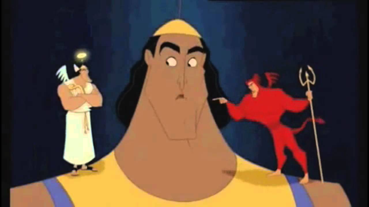
Then I wanted to use the shoulder angel idea were there is 2 characters either side of this person resembling flight and fight. I would edit some speech bubbles, some sort of text that would implicate that they are pouring thoughts into the persons head and what would happen if he chose that option to go with. I thought this would be a good idea as the angel and the devil are completely different characters and they pour different comments into the persons ear, trying to convince them to go with their plan or with whatever they're thinking which Is the same as fight and flight. As they are completely different and can both lead onto different endings in a scenario.
The text I then thought about was the title at the top of the page which would stick out of what the poster is going to be explaining. I was thinking of making the font stand out or be relatable with what ever theme I was going to use for the poster background. I then wanted a brief meaning of what fight and flight is underneath that title or close by. Then down below would be the images I previously spoke about. The last part of text I thought about would be if I was going to include little facts about anxiety or helplines around the poster and make them stand out by having a colourful object around it for example a bright pink star, a yellow heart, etc..
POSTER DEVELOPMENT:
I did not use Photoshop to create my poster but I did however use a website which allowed me to edit overlays, text, crop, filters, and a load of basic tools which I could use to create the poster I want to be created. The website I used was called Pic Monkey which I have had alot of experience with in the past and does also have some features that Photoshop does have, so I used both my knowledge of using the software pic monkey previously and what I have learnt on the college course about using Photoshop which came in handy. Here is a link to the website- https://www.picmonkey.com/
Below is a picture of what the editing programme looks like whilst using.

SIZE DEVELOPMENT:
The first thing I did was google image search a correct size A4 piece of paper that I could easily use as a starting image to create this poster.
Which looked like this:
I then decided to go with a theme of a graffiti style poster which I hope would stand out and grab the attention for the audience of teenagers as that is who I am wanting to be aiming at most as they are not as aware as others according to my little survey I did. I then chose a white brick wall backdrop layout which I thought would look nicely with what style I want the poster to turn out looking like.
I had to save the image from google and open as an overlay on my A4 picture. I then had to resize the image of the brick wall as it needed to be dragged out bigger to fit and fill the A4 paper up so it then looked like this.

OVERLAY DESIGN'S:
I then thought about how I would design this wall, It wasn't really important to do but I wanted to make my poster style stand out with bright colours and design. So I google image searched looking for some graffiti, tried to find ones that wasn't over the top, just little design's I thought was perfect. I then saw a paint can which looked good so I overlayed it onto my poster but I didn't quite like it. I then thought about making the title of the poster stand out with an effect and I thought about the paint can and I came to a decision of using paint splatters. I wanted to have a colourful one and I found the perfect design. I then overlayed this onto the top of the wall and that effect stands out nicely.


TEXT DEVELOPMENT:
I then added the text and searched for a font that would sort of look like graffiti and the font I chosen was the closest I could get to it. I thought it suited well and I started off by applying the blue font but it looked really plain and It wouldn't really catch my attention if I was to see it. I then duplicated the font so it was the same size, dragged it across a little and I then looked for a different colour to help it stand out and white and blue went together So I went for that choice.

PHOTOGRAPHY IMAGE USAGE:
So I first of all randomly google image searched 'transparent man thinking' and thought I could use it as a character for the poster. I then emailed Faye and asked about the usage of the image before I saved it. Once finding out about how I have to use my own photography I then just kept it there to see how everything would fit nicely onto the poster try and save some space for facts to place on the poster, the shoulder characters and the definition of fight and flight. I then decided to have a graffiti splatter behind the character as it looks good and would go with the style I am aiming to get my poster looking like. The colours I liked with the graffiti so I decided to pick this particular one.


TEXT ADDED ONTO POSTER:
For this I decided to stick to the same font I used for the type as I thought It would just look really dodgy and not good with a different style text. I went with the exact same technique with having one coloured text which was the bright colour of blue. Then I duplicated the text and added a white on top of it to make it stand out. I then did the exact same with text underneath and just changed the colour of the font. I repeated the technique again and added the same colour I started with as I liked the way that ended up looking like. On the photo of the evidence however you can't really see it as well as I can see it. It stands out alot better on the poster itself which will be uploaded somewhere down below.
Moving on I then wanted to sort of find a little image that resembles to the text and also goes with the whole graffiti theme that I want to show. I found this transparent fist that I could use and it was a bonus that the effect with the fist looked like it was peeling from something which might not be noticeable as it blends with the wall background. I chose to put it there as it just blended in the most in the current spot it is in.


ADDING THE MAIN IMAGE & CHARACTERS ONTO POSTER:
For the editing of this main image I used a software I have downloaded on my laptop which is similar to Photoshop but has its faults and is alot harder to work than Photoshop. I used coral Paint shop that I had once downloaded for free to edit a photo to get a transparent background. Luckily I could use this software to do the same with this main image. I used a tool which automatically cropped round the person I needed for the poster. I then deleted the background of the original image and was left with the person I photographed. I was then left with the transparent background, I altered the brightness and contrast a little and I then saved that to my computer. I then went onto pic monkey and added the image onto the poster. I position it exactly where I wanted it and then I was pretty much done with that. I then decided to use the characters from the Disney film inside out to resemble flight and fight. I used sadness and joy both to display the moods of each option that they are trying to persuade the individual to choose. Sadness resembles flight and also shows the path in which would end up being the worst one to choose, shows alot of negativity and I thought was a really good choice to use. Joy then resembles fight and shows the most positive outcome in which is the better option to choose. I got both of the characters from a google image search for transparent inside out characters. Saved them to my desktop. Then added them as separate overlays and positioned them exactly where I wanted them.


FINAL TEXT ADDED:
FINISHED POSTER:


 This one I am using as I find it powerful that it is showing the person's thoughts and I could combine this with the flight or fight idea. I could create two characters to go either side of my own photography like this and use the devil and angel idea but put my characters being on either side and I would name my characters fight and flight. I would show what they are both trying to persuade to get out of a situation that someone with anxiety doesn't feel comfortable with. For example if someone was to want to ask a teacher a question in class because they was stuck with the work. I could show the flight side telling her what would happen if she leaves the situation shes in so I could illustrate flight saying that if she doesn't ask then she wouldn't then understand the work and would fall behind and that the person is going to struggle with the work in silence. It's showing that flight could in general be a negative option to take. Then I could show fight saying things like 'if you ask you will understand the work and be able to carry on', 'you won't be falling behind on work'. This would be showing that fight in general could be more positive than flight. I will try and illustrate this by using this theme but different. Here is a picture if you didn't understand the structure I want to use for this below.


